Urban Systems Lab: Where I Fell in Love with Maps
Role: Data-Visualization Lead · 2016–2019
Urban Systems Lab at NYU is where I first got my hands on real geospatial data. I joined as the technical lead for data visualization, tasked with building tools for the UREx Sustainability Research Network, a consortium studying urban resilience to climate extremes across ten US and Latin American cities. What I didn’t expect was how fundamentally it would change the way I think about data.
Discovering the power of spatial data
Before USL, I understood data as rows and columns. Relational databases, spreadsheets, CSVs. They’re powerful, but they abstract away something essential: where things happen.
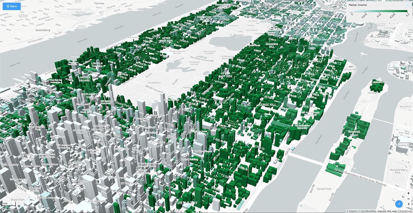
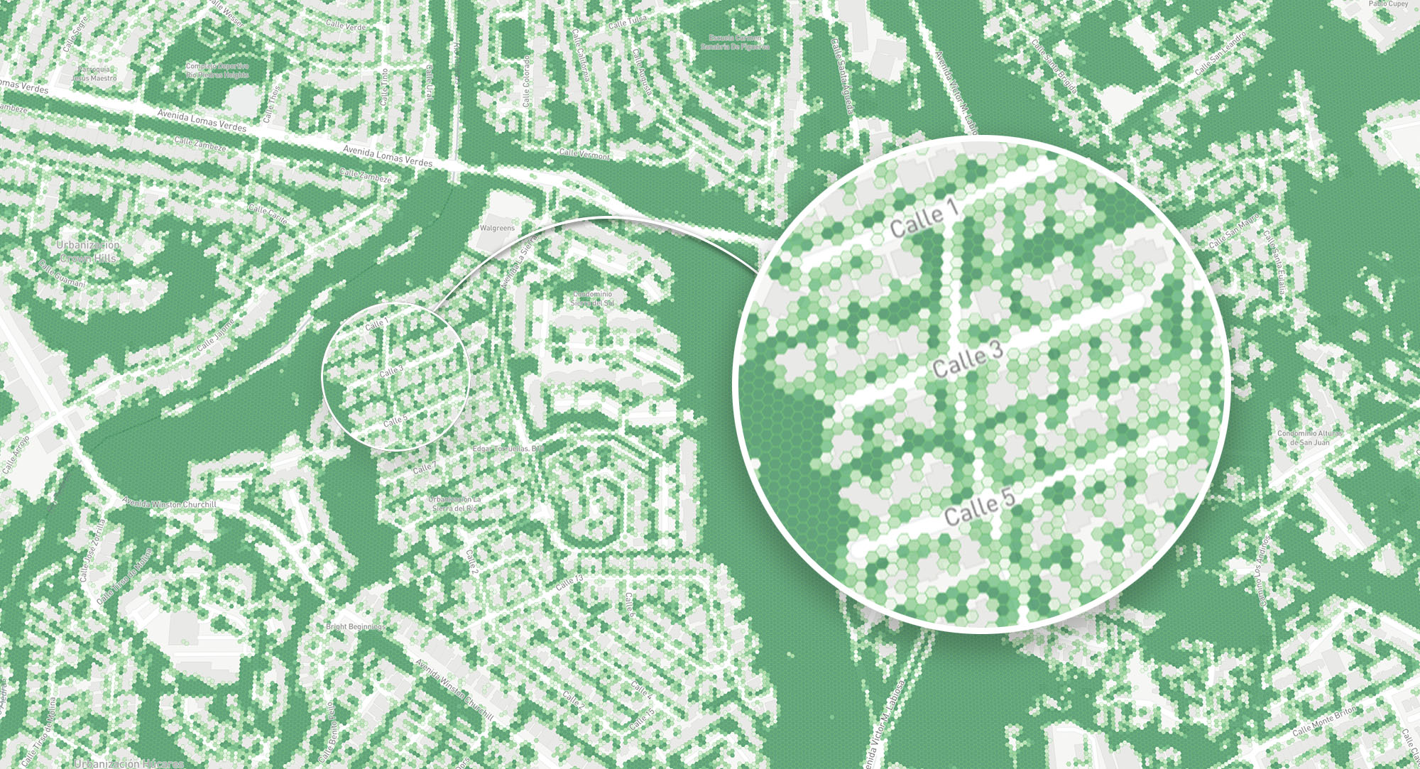
The moment I started working with geospatial datasets, something clicked. Overlaying social vulnerability indices onto a 3D cityscape of New York, watching flood risk data drape across building parcels at neighbourhood scale, I could suddenly see the story the data was telling. A table might show that a census tract scores high on a heat vulnerability index. A map shows you that it’s the same block with no tree canopy, ageing infrastructure, and an elderly population. The spatial dimension doesn’t just add context; it changes comprehension entirely.
I fell in love with it. The tactile feeling of panning across a city and understanding its systems through layers of information was unlike anything I’d experienced with traditional data tools. That obsession with geospatial data has stayed with me ever since.
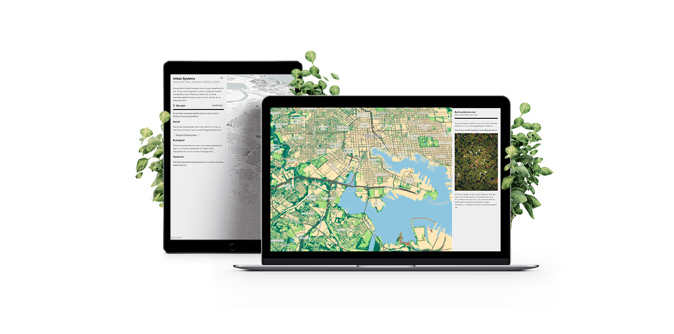
Building a platform, not just a project
Early on, I made a deliberate choice that shaped everything that followed. Rather than building one-off visualizations for individual research papers, I pushed to build a proper mapping platform: something researchers could use without writing a single line of code, something that could outlive any individual project.
Research software has a reputation for being disposable. Limited budgets, short timelines, and the publish-or-perish cycle mean most tools get abandoned the moment a paper ships. I wanted to break that pattern. I wanted to build something researchers would actually keep using to communicate their science.
The platform I built used Vue.js with Nuxt on the frontend and Firebase for data storage, authentication, and real-time content updates. Mapbox GL handled the mapping layer, chosen for its support for 3D building extrusions, vector tiles, and custom styling. Content creators could update visualizations in real-time without touching code.
That bet on building a platform paid off. The core mapping infrastructure became the foundation for multiple products that spun out of the lab:
- Ocellus evolved into USL’s flagship visualization tool, bridging quantitative social, ecological, and infrastructure data with qualitative insights from community workshops. It now serves as an interactive platform for researchers and urban planners across the UREx network.
- Stormwater.NYC became a multi-hazard risk decision-support tool for New York City, integrating floodplain projections, demographics, land use, and critical infrastructure data. It was the first tool of its kind to offer integrated scenario comparison for flooding risk in NYC.
- Green Roofs visualizations helped quantify the performance and coverage of green infrastructure interventions across the city.
Each of these products built on the same mapping platform, the same geospatial pipelines, and the same design philosophy: make the data accessible so researchers can focus on communicating science, not wrestling with software.
Bringing new tech to research
I was genuinely excited about bringing modern web technology into a space that was still largely reliant on desktop GIS tools and static images in PDFs. I wanted researchers to be able to share an interactive 3D map as easily as sharing a link.
Geospatial narratives
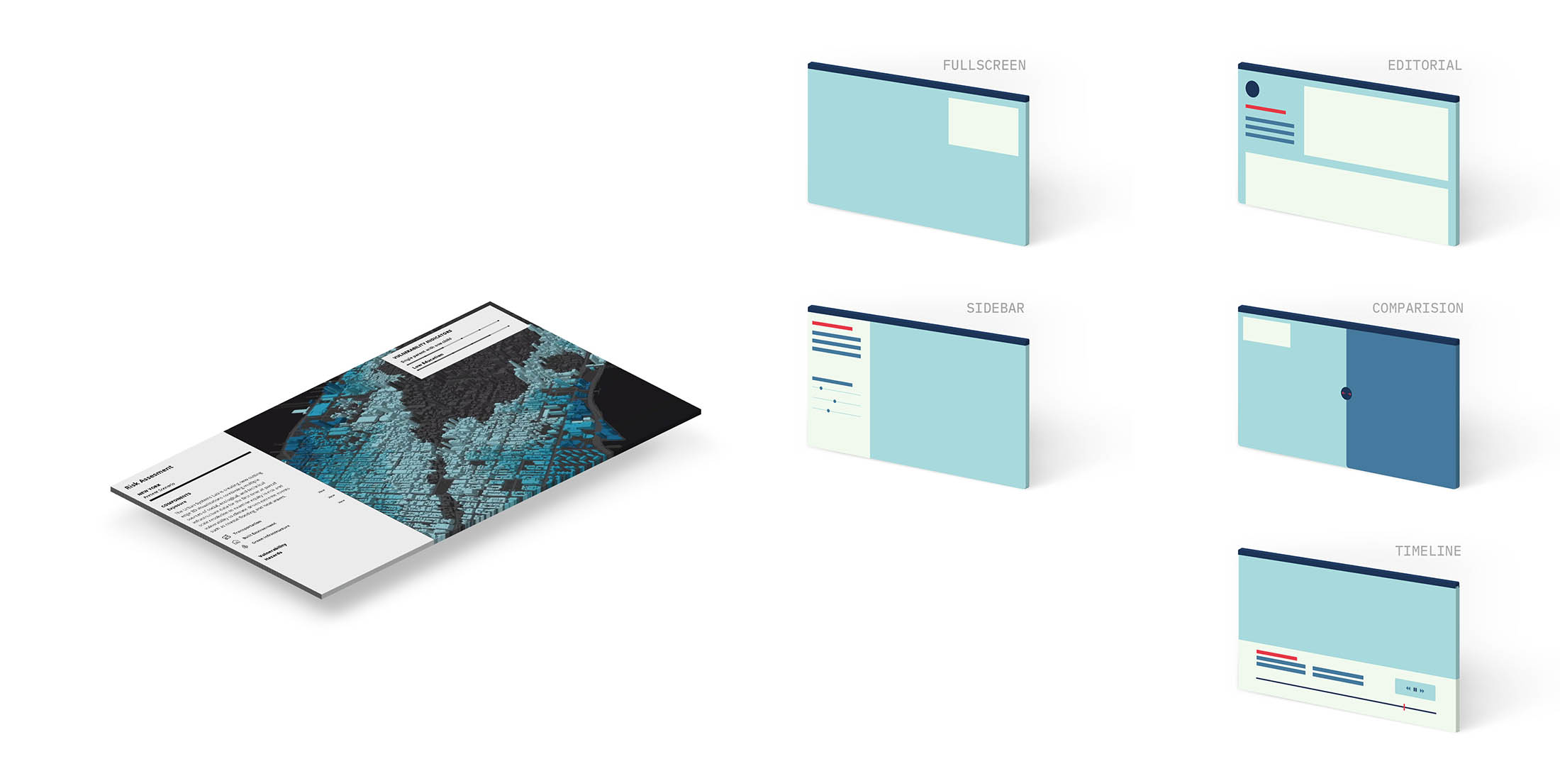
One of the features I’m proudest of was the narrative system. Raw geospatial data, even beautifully rendered, needs interpretation. I designed and built a storytelling layer where researchers could author articles and choreograph map views to match their content. They could guide a reader’s attention to specific neighbourhoods, zoom into building-level detail, and annotate what the data meant in context. We offered multiple story templates (cards, long-form articles) so authors could pick the format that suited their message.
This was about empowering researchers to communicate science on the web with the same richness they’d get in a lecture hall, but to anyone with a browser.
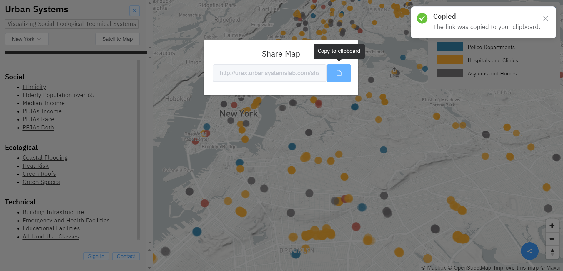
Sharing perspectives
User feedback made it clear that researchers needed to share specific views of the map with collaborators and in reports. I implemented a share feature with a link shortener so anyone could capture their exact perspective (location, zoom, active layers) and pass it along as a short URL or screenshot.
The data pipelines underneath
Behind the visualizations, I built the geospatial processing pipelines that made everything possible.
Spatial joins at scale
The core challenge was taking parcel-scale disaggregated data and draping it over 3D cityscapes. Spatial joins on datasets this large (856,000 lots and over a million buildings in NYC alone) are computationally brutal. A naive single-core approach can take hours or days.
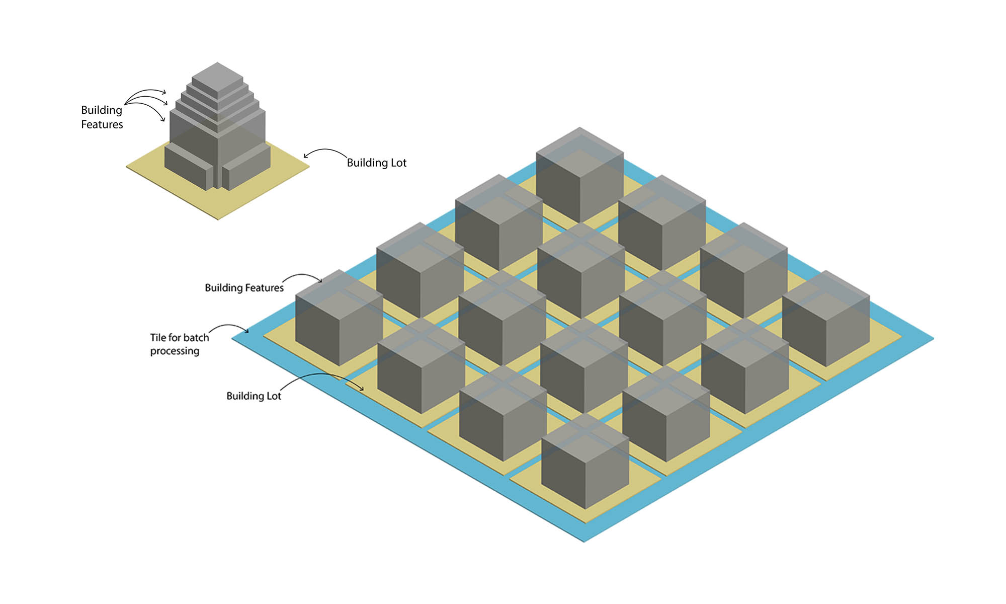
I wrote a multi-threaded spatial join in JavaScript that operated on spatially indexed GeoJSON collections in MongoDB. The script tiled both datasets for batch processing, distributing the load across cores. The polygon-in-polygon join processed the entire NYC building and lot dataset in 17 minutes on a quad-core laptop.
Raster to vector conversion
Many of our source datasets arrived as massive GeoTIFF raster files. But to support interactive features like clicking, filtering, and on-the-fly styling, we needed vector tiles. I built a multi-threaded Python pipeline that ingested large raster files and output GeoJSON, which we then converted to MBTiles for serving to browsers.
| File | Type | Size |
|---|---|---|
| Original Tiff | Raster | 8.20 GB |
| Raster Tileset | Raster | 508 MB |
| 2-meter Tileset | Vector | 500 MB |
| 5-meter Tileset | Vector | 150 MB |
Impact and legacy
The platform was used to communicate climate vulnerability and equity science across the UREx network’s ten cities. The NYC map played a direct role in collaboration with the Mayor’s Office of Recovery & Resiliency and the Science and Resilience Institute at Jamaica Bay. It was the first time 3D visualizations at parcel-scale resolution were used to examine equity in risk and vulnerability to climate-driven extreme events like coastal flooding and heatwaves.
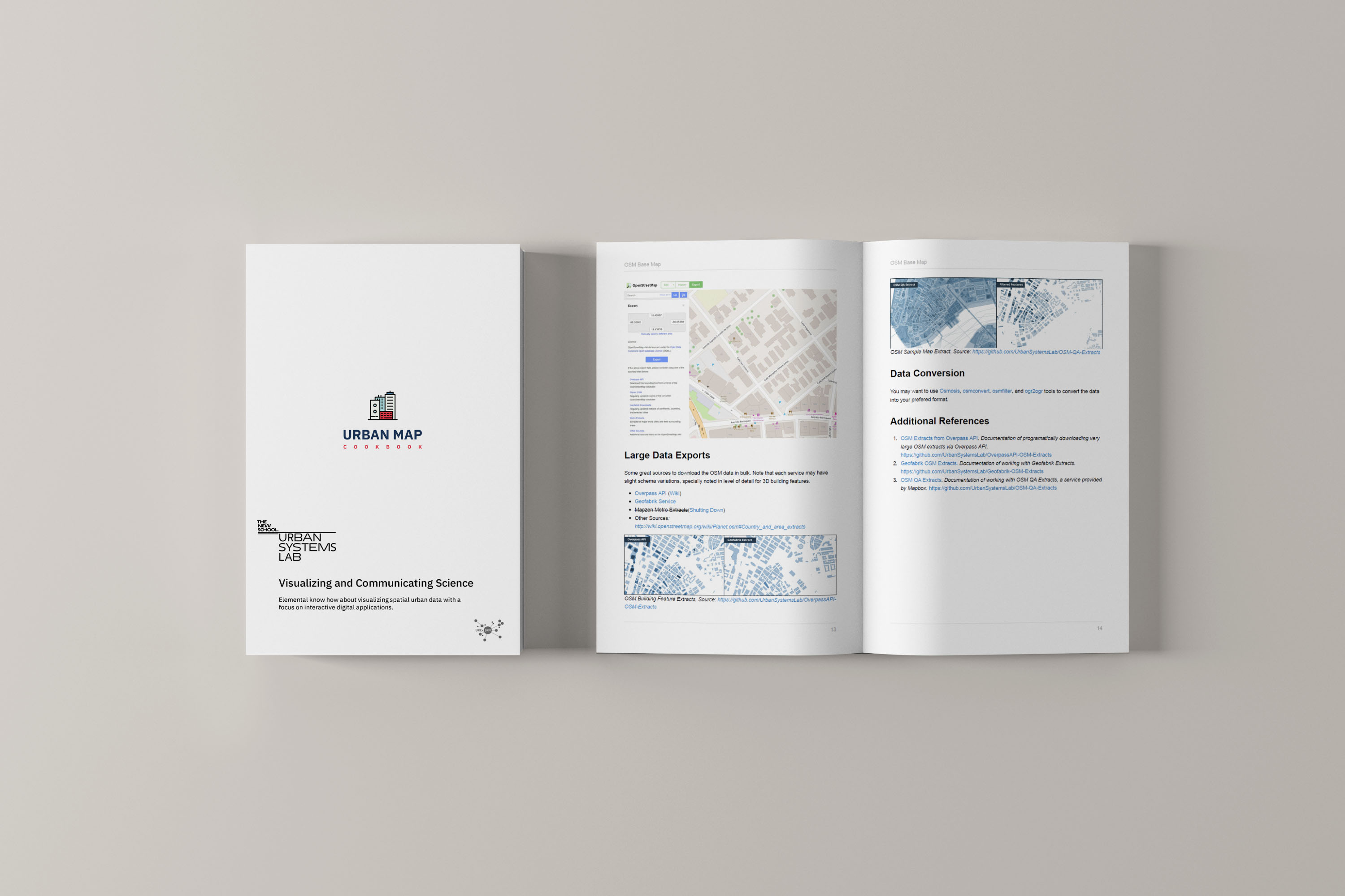
I also wrote a cookbook with fellow USL researchers to document the principles behind geospatial visualization, so the work could continue and evolve as more researchers joined.
What I’m most proud of is that the platform didn’t die when I left. It evolved into Ocellus, powered Stormwater.NYC, and continues to serve researchers who are communicating science to the people who need it most. That’s the outcome I care about: building high-quality tools that let researchers focus on the science, not the software.
Presented at
- Data-Visualization Workshop at Modelling Complex Urban Environments, Waterloo Institute for Complexity and Innovation, Canada, 2018
- URExSRN Annual All Hands Meeting, demonstrated visualization platform, Phoenix Arizona, 2018
- Urban Climate Resilience at Ecological Society of America, 2018
- Data-Visualization Seminar at “Resilient Cities, Livable Futures” Data-Visualization Session, The New School, New York, 2017